Technology
Facebook Updates Branding: Refreshes Logo, Colors
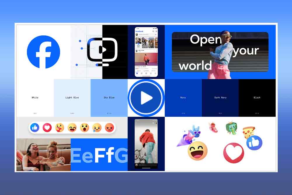
Facebook updates some of its visual assets in a bid to refresh its “identity system,” the company announced in a blog post on September 20, 2023.
This comes as the social media giant made changes to its branding that focuses on “fostering effortless, self-initiated exploration and connection across every touchpoint,” according to their announcement.
As part of the refresh, Facebook updated its logo, making it bolder, more dynamic, and visually accessible. The core blue color, synonymous with Facebook, has been revamped to provide stronger contrast, making the iconic “f” logo stand out.
Moreover, the social media giant’s wordmark also has an update, which uses Facebook’s custom typeface named “Facebook Sans.”
“Using our custom typeface, Facebook Sans, we redesigned the wordmark and logo to create a consistent treatment and improve overall legibility across Facebook,” Meta said, adding “Similar to the changes to the logo symbol, these refinements allowed us to build upon the heritage of our identity, while creating a stronger relationship between how the wordmark pairs with the rest of the typeface.”
Other updates include changes to its color palette, which now features different shades of blue.
“We also developed a new color palette. We crafted a new set of hues, tones and contrast ratios that felt unique to the Facebook brand and are optimized for accessibility. Blue, unsurprisingly, remains the foundational color, and pairs with our expanded spectrum to create stronger distinction for Facebook in marketing and when speaking to people in the app. The deep tonal range of secondary blues allows for flexibility while providing balance as a single expression of our brand identity,” Meta said in the blog post.
Reactions will also get a new look as well, now with a more three-dimensional look, which Meta describes as now having “more dimensionality and emotion.”
“Through our expanded color palette, we were able to evoke more dimensionality and emotion in Reactions. We adjusted colors to meet color accessibility guidance so that our iconography is legible at any size, flexible enough for different needs and easy for people to interact with. Leaving no pixel unturned, we rebuilt the entire iconography system so that it scales with a wide range of expressions across each moment within the app.” (GFB)


